Cobbs Hill Estate Rebrand
Design Brief:
The wine label design will focus on appealing to a younger, 18-30 demographic, with a budget-friendly and approachable aesthetic that reflects their preferences for fun, modern, and relatable products. The design will be contemporary, using bold typography, vibrant colors, and dynamic graphics to create a sense of excitement and youthfulness. To keep it accessible, the label will avoid overly traditional or complex imagery, instead opting for minimalist and trendy designs that feel fresh and on-trend. The goal is to make the wine approachable and easy to connect with, offering a sense of sophistication without being intimidating. This design will strike the right balance between being playful and stylish, while still maintaining the quality of the winery’s brand, ensuring it appeals to both the budget-conscious and the design-savvy younger audience.
Response to the brief:
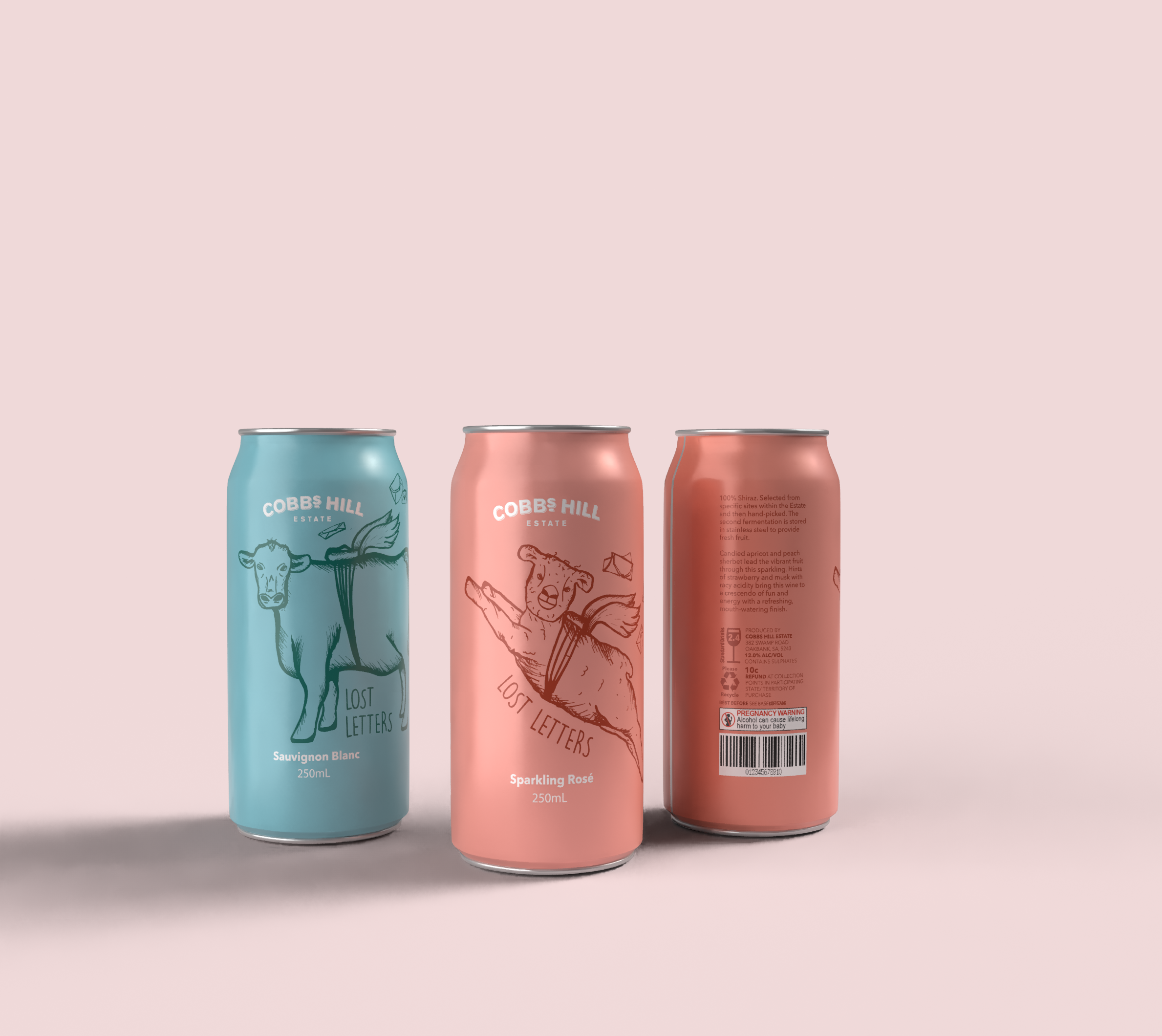
I chose Cobbs Hill Estate for its rich history, originally known as Cobbs and Co, which played a key role in Australia’s early days by supporting travelers, gold miners, and delivering Royal Mail from 1854 to 1924. To honour this heritage, I incorporated images of the estate’s animals—cows and sheep—into the design, with background letters symbolising the stagecoaches that once carried mail across the outback. For the colour palette, I used blue and rosy pink to reflect the flavors of Sparkling Rosé and Sauvignon Blanc.
The wine is offered in a portable, single-serving can, catering to the younger demographic who prefer smaller portions and affordable options. The bold, high-contrast colors and illustrative artwork make the label eye-catching, ensuring it stands out on shelves. The design combines heritage, convenience, and style, making it the perfect choice for a modern, budget-friendly wine experience.